
VIGOR DONG SHIH
VIGOR DONG SHIH

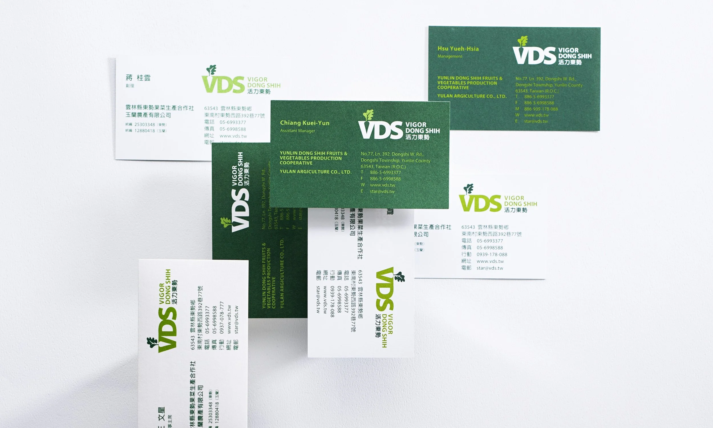
Client 東勢果菜生產合作社
活力東勢
面對全球市場對食品安全日益嚴苛的要求,東勢果菜生產合作社不僅深耕內需,更積極佈局國際外銷。在競爭激烈的市場環境中,如何精準建立品牌識別,並將核心價值有效傳遞給消費者,是合作社轉型升級的首要挑戰。
活力東勢
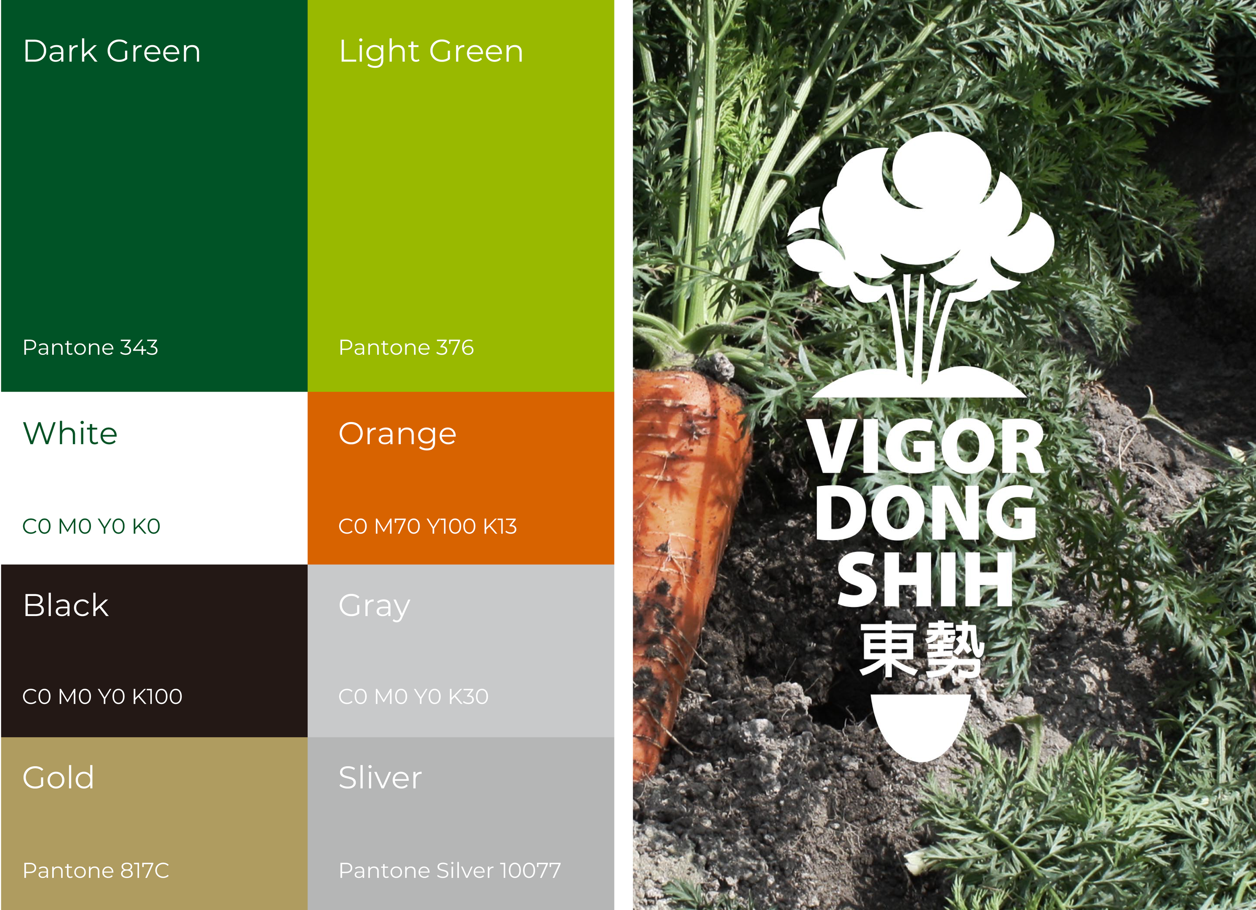
COLOR SYSTEM
輔助色
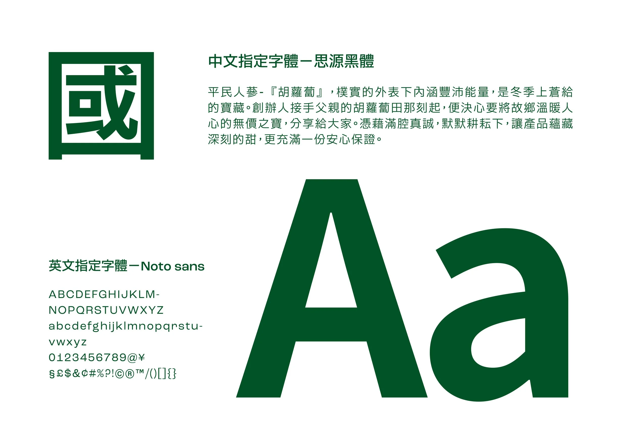
TYEPOGRAPHY
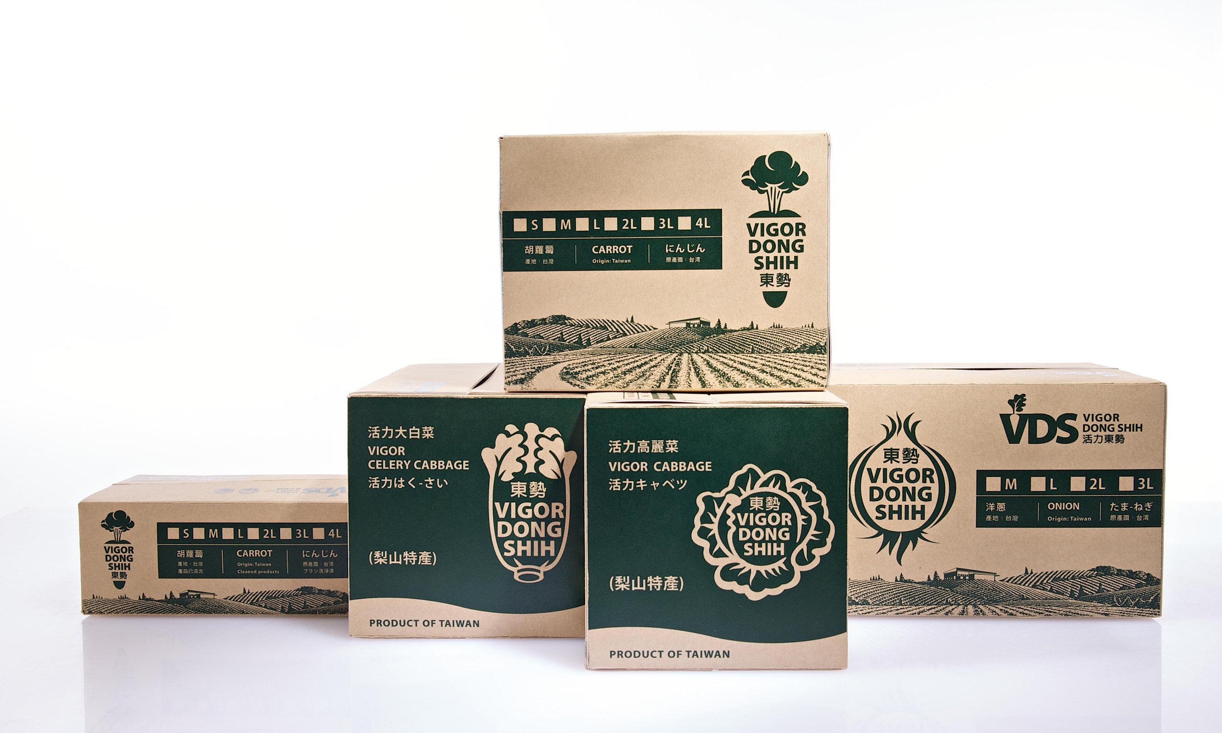
PACKAGE

過程與成果
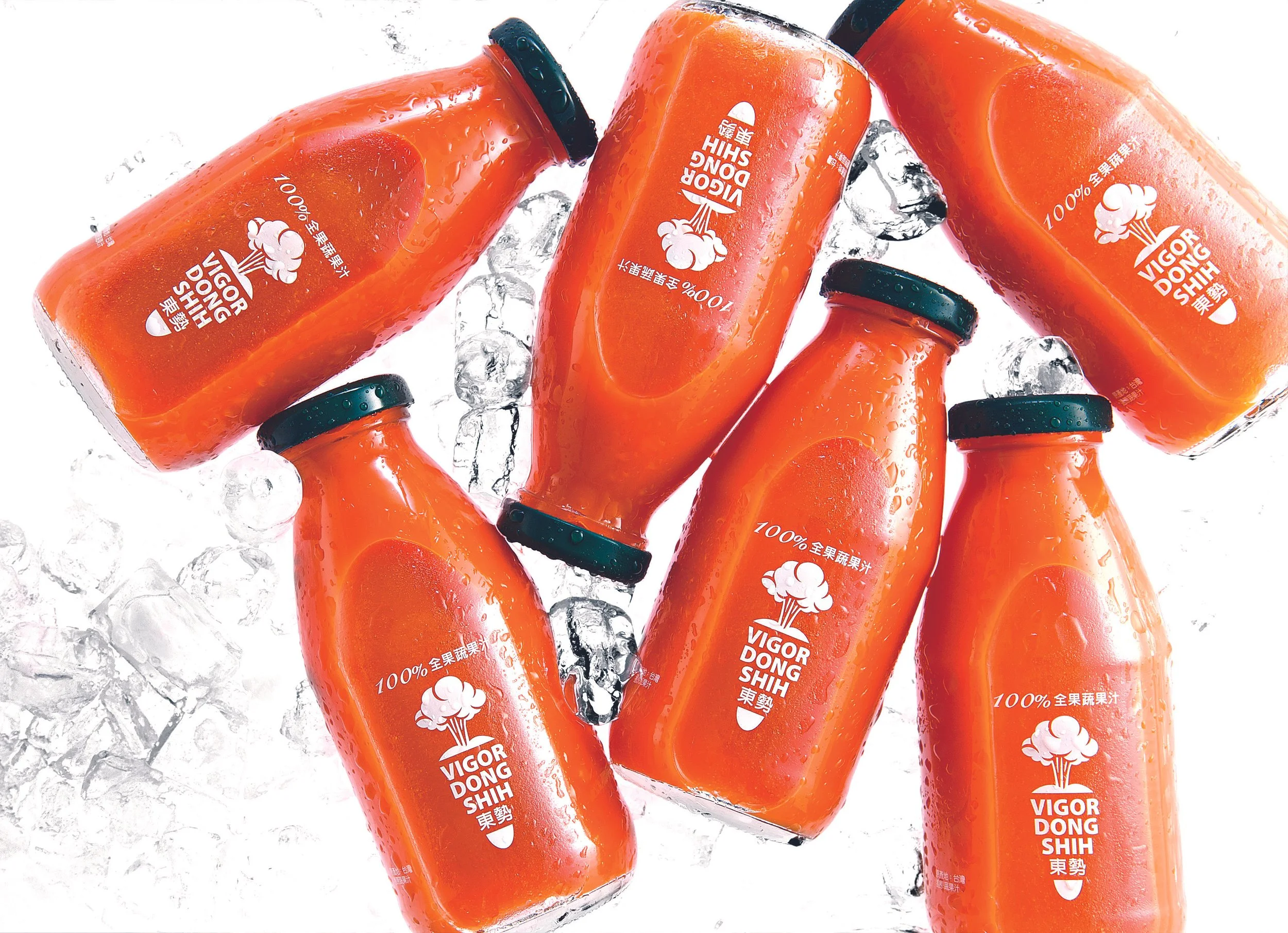
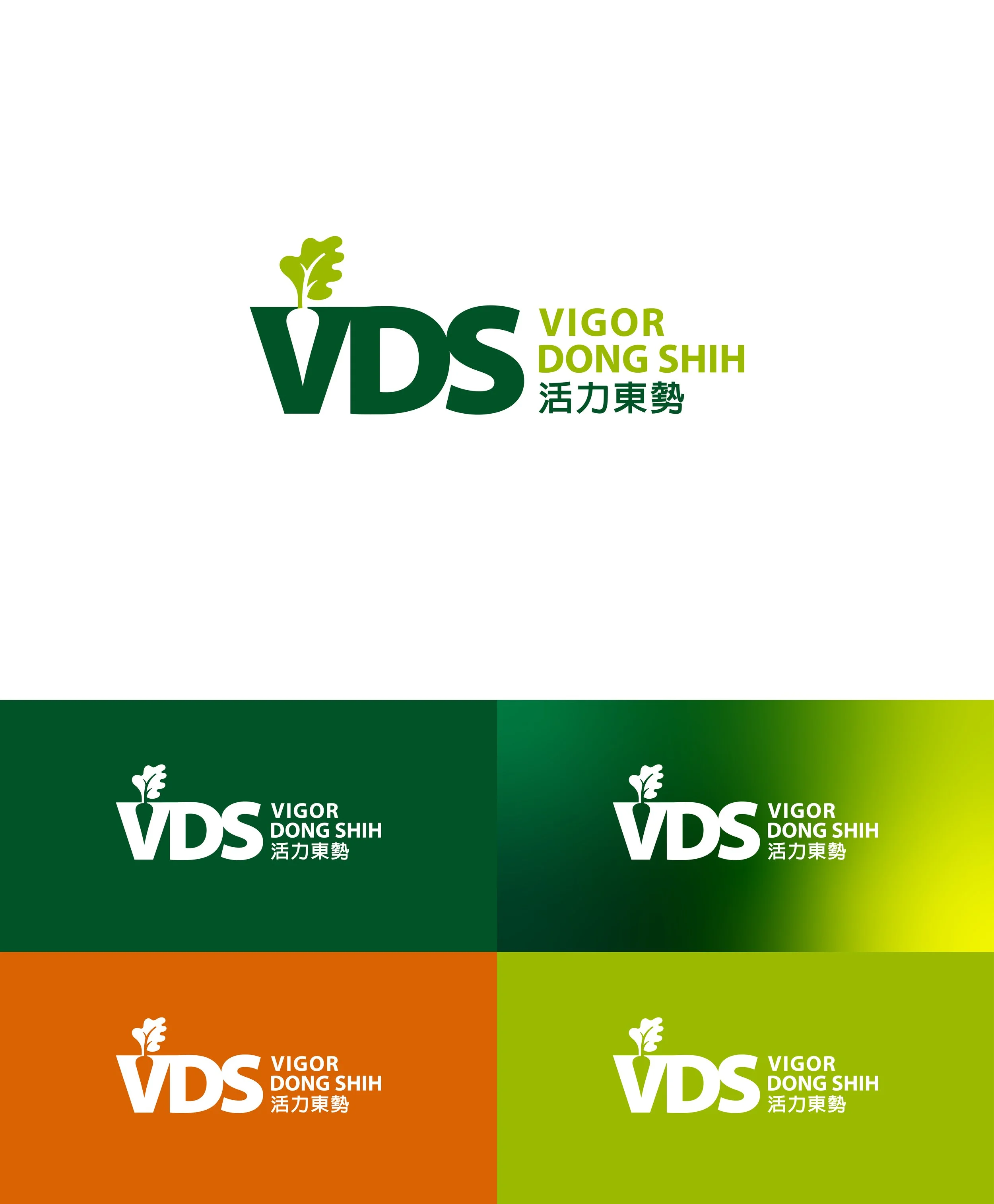
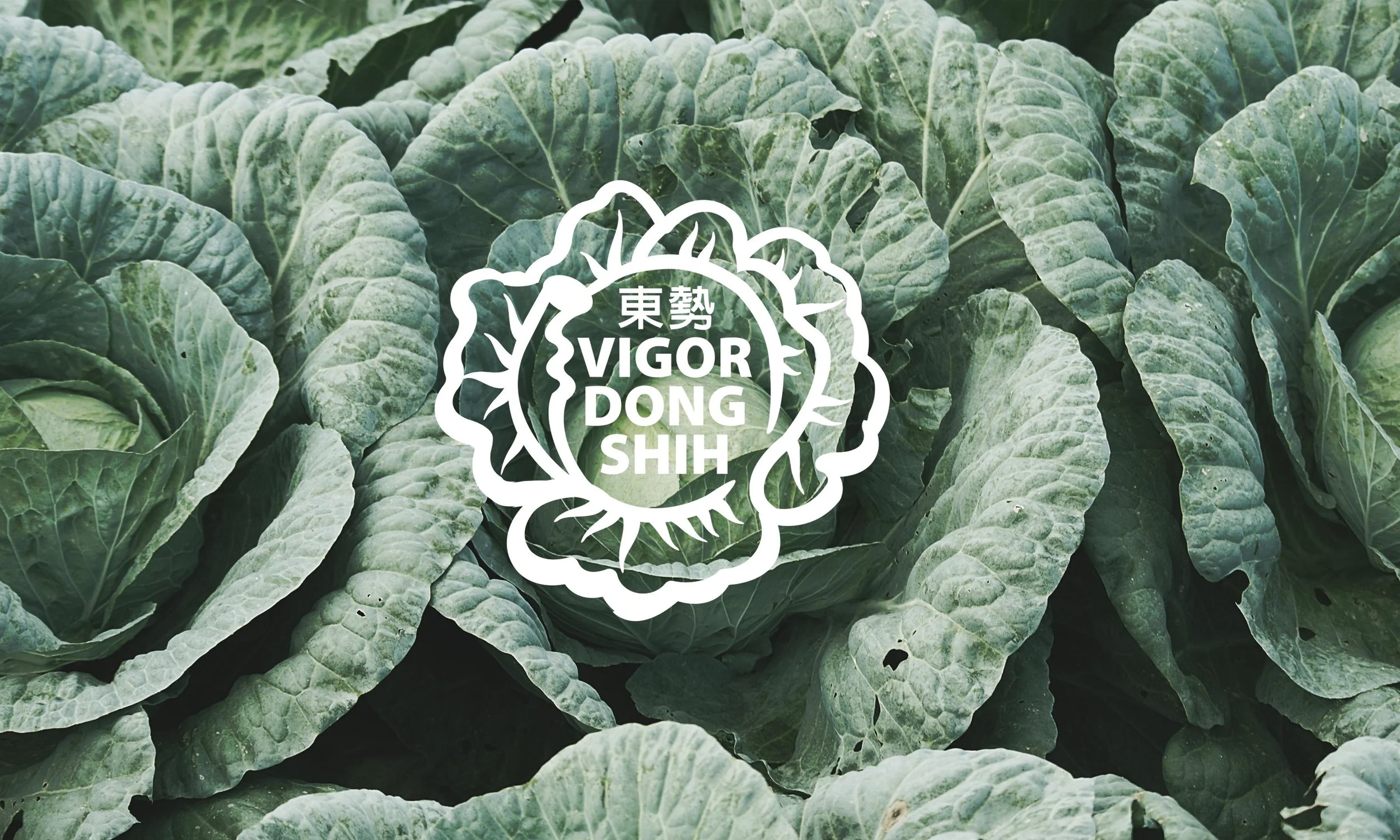
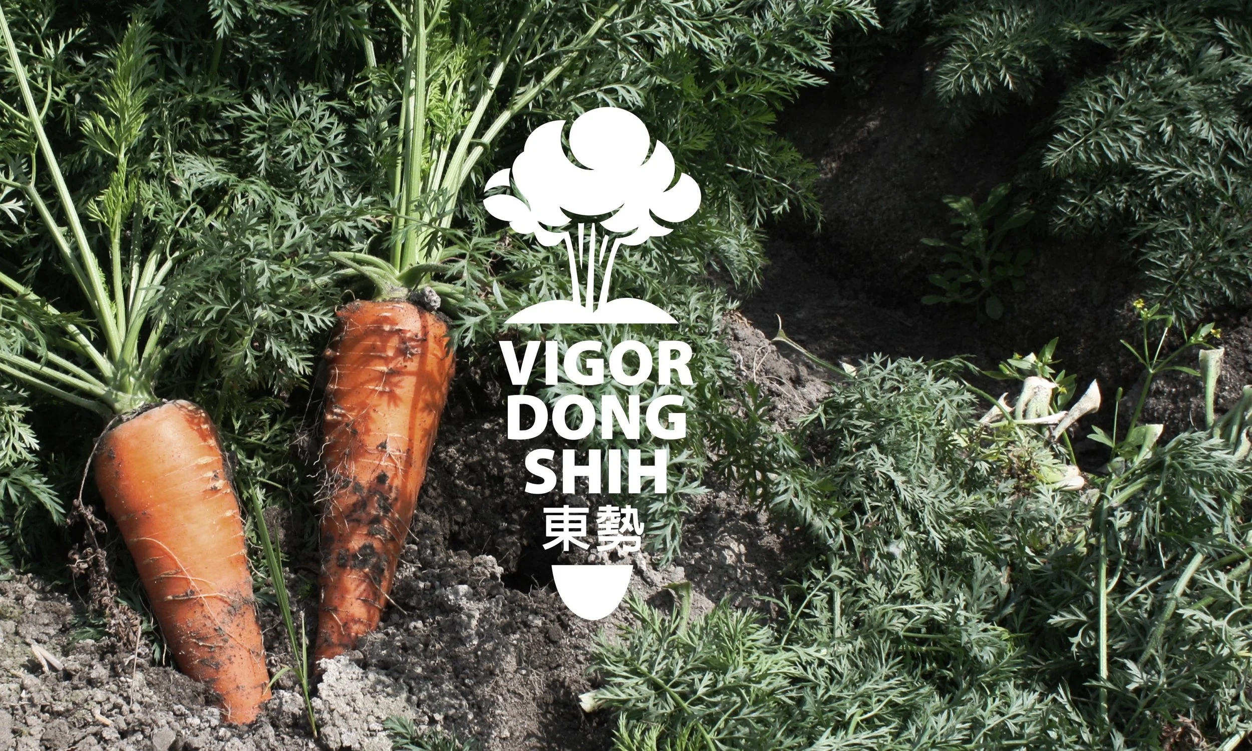
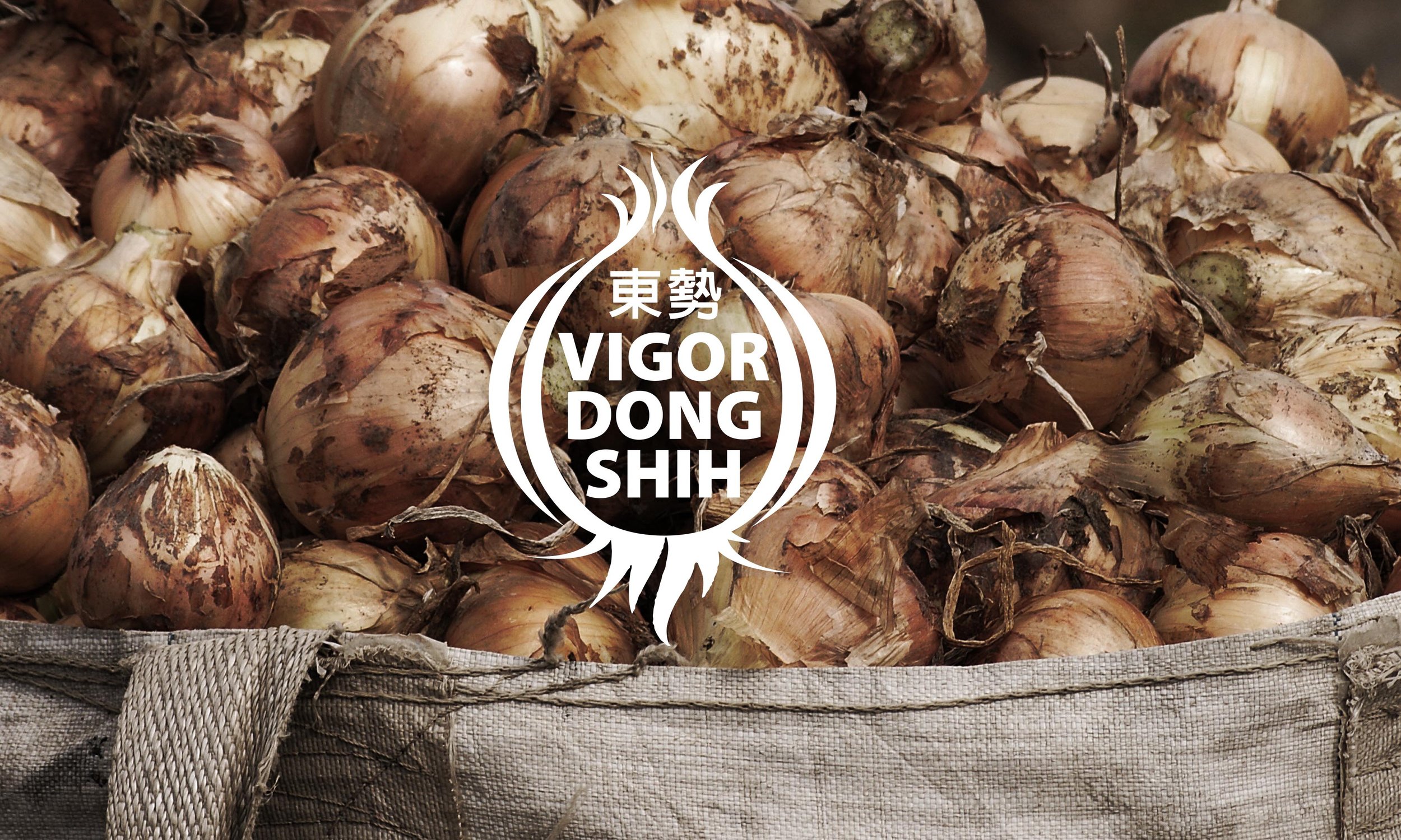
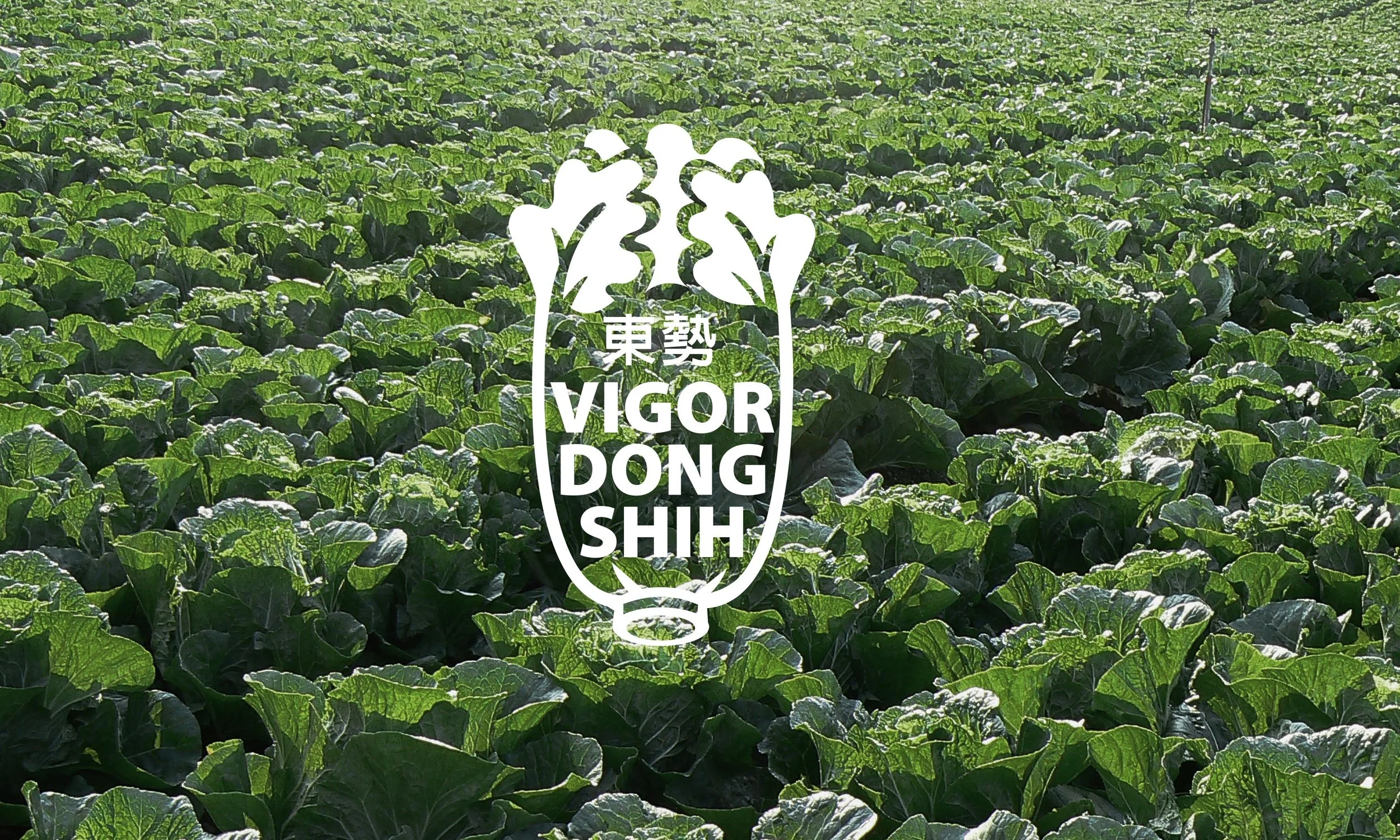
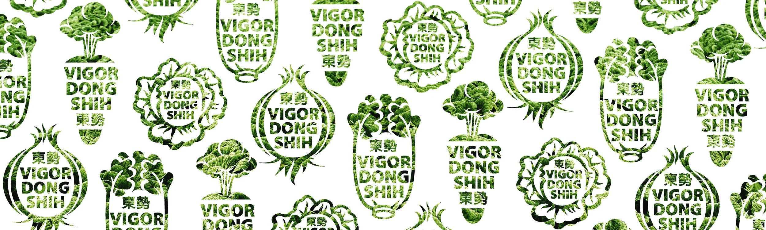
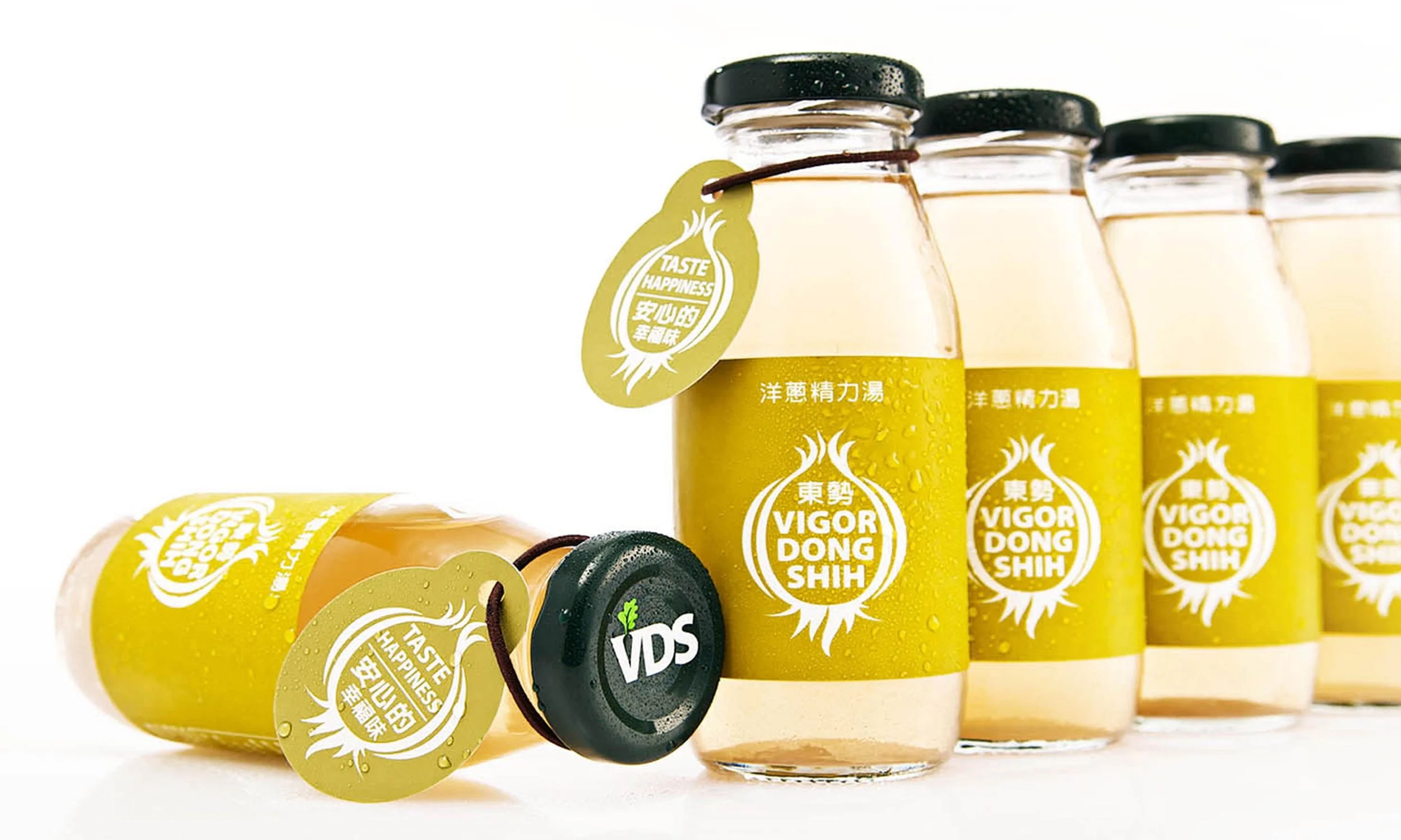
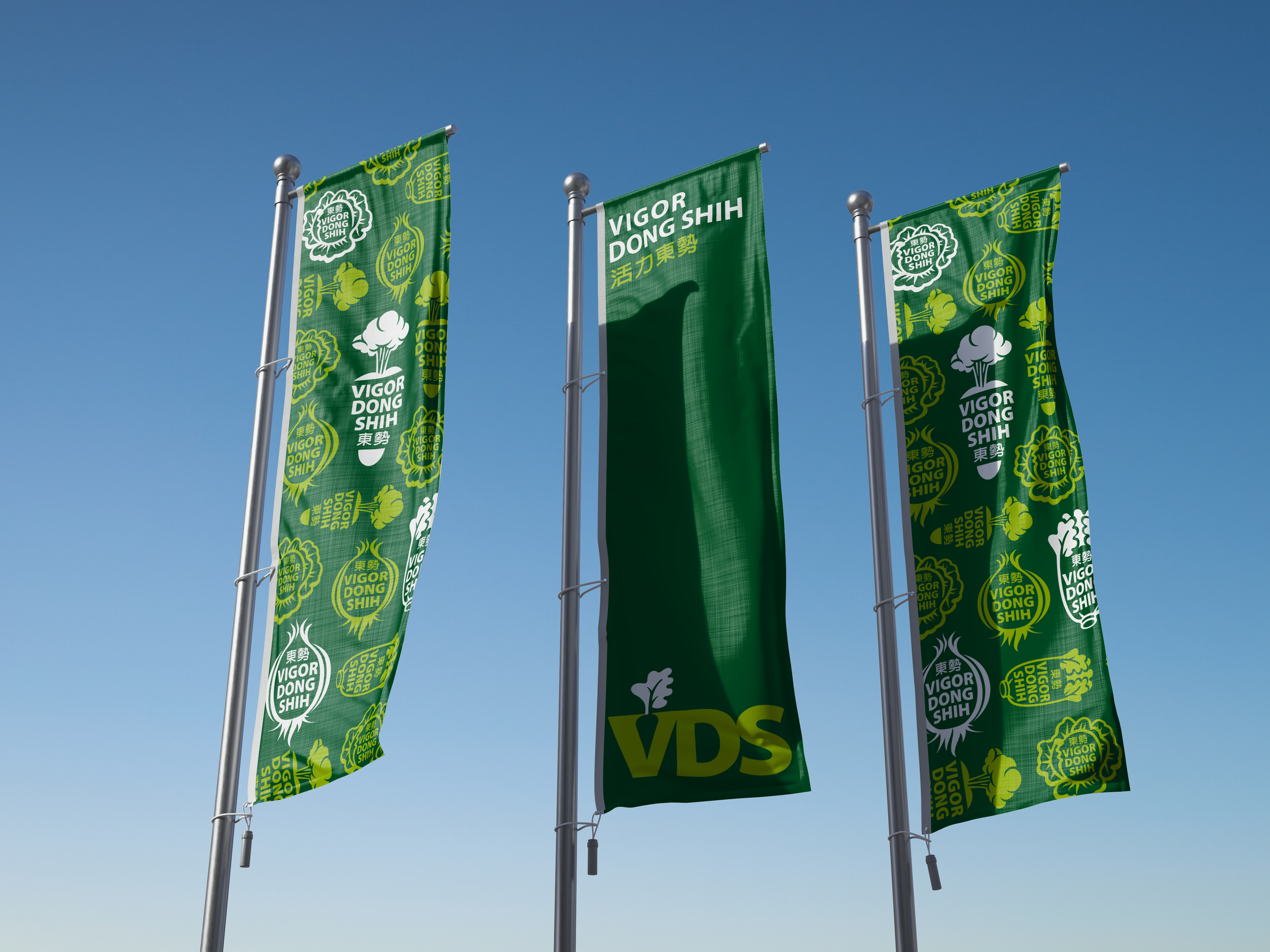
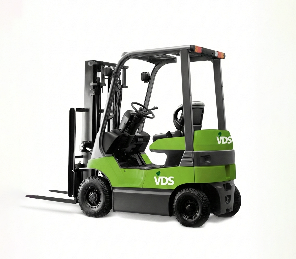
以「VDS活力東勢」為新品牌定位,象徵元氣與活力。主力產品胡蘿蔔、大白菜、高麗菜及洋蔥,以簡潔流暢的象徵圖形化身為產品標籤;「安心的幸福味」作為品牌標語與願景,藉由整體性的品牌規劃,強化產品安全認證與生產履歷,天然飽滿的蔬果汁透過品牌與包裝結合,直達消費市場核心。
Process and results
Hence, "VIGOR DONG SHIH" (VDS) is launched to relocate their brand, symbolizing their energy as well as vigor. Carrot, Chinese cabbage, cabbage and onion as the major products, are incarnated to be the product label through the symbolized figures with simplicity and fluency. "Scent of Happiness at Ease" shall be the slogan and vision where the safety certification and production history are strengthened via the integrated brand strategy. The core of the consumption markets shall be accomplished through the combination of brand and packing of the natural fertile vegetable juices.
活力東勢
果菜生產合作社,在消費市場對食安日益嚴峻的品質要求下,除了內需市場外,更需要積極擴展外銷市場,在競爭激烈的環境中,如何明確地傳達到消費市場,是東勢果菜生產合作社所需要面對的問題。
VDS Vigor Dong Shih
Under the harsher demands for food safety by the consumption markets, the Vege Production Cooperative further needs to be promoted for exports abroad and not just limited to domestic needs. Under the environment of severe competition, it would be the problem in priority facing the Dong Shih Vege Production Cooperative to convey their ideas to the consumers.
Vigor Dong Shih Brand Design
活力東勢|品牌形象設計
2010Brand Identity|SPARKLY IDENTITYCreative Director|Jay Chang Project Manager|Rachel Wang MORE WORKS
鯉魚
Menu&Graphic Design

海狼
Brand Identity
7-11 CITY CAFE
Packaging Design